
In today’s mobile-first world, having a website that works beautifully on every device isn’t optional—it’s essential. More people browse websites on their phones than on computers, and if your site doesn’t display properly on mobile devices, you’re losing potential customers every single day. Freshosoft specializes in Responsive Web Design Kolkata, creating websites that automatically adapt to any screen size, delivering perfect experiences whether visitors use smartphones, tablets, or desktop computers.
What is Responsive Web Design?
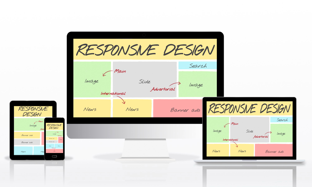
Responsive web design means your website automatically adjusts its layout, images, and content to fit any screen size. Instead of creating separate websites for mobile and desktop, responsive design uses flexible layouts that reshape themselves based on the device being used. When someone visits your site on a phone, they see a mobile-optimized version. On a tablet, it adjusts accordingly. On a desktop, it expands to use the full screen. All this happens automatically, providing seamless experiences across all devices.
Why Your Business Needs Responsive Web Design in Kolkata
Mobile Usage Has Overtaken Desktop
Most people in Kolkata and across India now access the internet primarily through smartphones. Whether searching for local businesses, comparing products, or making purchases, mobile devices are the preferred choice. If your website doesn’t work well on mobile, visitors will immediately leave and find a competitor whose site does. Responsive Web Design Kolkata ensures you never lose customers due to poor mobile experiences.
Google Prioritizes Mobile-Friendly Sites
Search engines, especially Google, now use mobile-first indexing. This means Google primarily looks at the mobile version of your website when determining search rankings. Websites that aren’t mobile-friendly get pushed down in search results, making them nearly invisible to potential customers. By investing in responsive web design Kolkata services, you’re ensuring your website ranks well in search results.
Better User Experience Across All Devices
Responsive Web Design Kolkata, Responsive design isn’t just about fitting content onto smaller screens. It’s about creating enjoyable experiences regardless of how people access your site. Buttons become touch-friendly, text remains readable without zooming, images scale properly, and navigation adapts to work perfectly on every device. Happy visitors stay longer, explore more pages, and are more likely to contact you or make purchases.
Cost-Effective Solution
Years ago, businesses needed separate websites for mobile and desktop, doubling development and maintenance costs. Responsive Web Design Kolkata eliminates this expense by creating one website that works everywhere. You save money on development, spend less time on updates, and maintain consistency across all platforms.
Future-Proof Your Website
New devices with different screen sizes constantly emerge—from foldable phones to large tablets to smartwatches. Responsive design automatically adapts to these new devices without requiring website redesigns. Your investment in responsive web design Kolkata protects you against future technological changes.
Freshosoft’s Approach to Responsive Web Design
As a WordPress Web Development Company in Kolkata, Freshosoft combines technical expertise with creative design to deliver exceptional responsive websites.
Mobile-First Design Philosophy
We start every project by designing for mobile devices first, then expanding to tablets and desktops. This mobile-first approach ensures the smallest screens get full attention, resulting in clean, efficient designs that work beautifully everywhere. Our WordPress Development Company Kolkata team understands that mobile experiences can’t be an afterthought—they must be central to the design process.
Flexible Grid Layouts
Responsive Web Design Kolkata use flexible grid systems that proportionally resize based on screen dimensions. Instead of fixed-width layouts that break on different devices, our grids fluidly adapt. Content automatically repositions, columns stack appropriately, and spacing adjusts to maintain visual harmony across all screen sizes.
Responsive Images and Media
Images that look perfect on desktop can slow down mobile devices and consume excessive data. Our responsive web design Kolkata approach includes optimizing images for different devices, serving appropriately sized versions based on screen size, and implementing lazy loading to improve performance.
Touch-Friendly Navigation
Mobile users interact with websites through touch, not mouse clicks. We design navigation menus, buttons, and interactive elements with touch in mind. Buttons are adequately sized for fingers, menus collapse into mobile-friendly formats, and interactive elements have proper spacing to prevent accidental clicks.
Performance Optimization
Mobile devices often use slower connections than desktop computers. We optimize every aspect of your responsive website for speed—compressing files, minimizing code, implementing caching, and ensuring fast loading even on slower mobile networks.
WordPress Development for Responsive Websites
WordPress provides an excellent foundation for responsive websites. As an experienced WordPress development company Kolkata, Freshosoft leverages WordPress’s flexibility to create responsive sites that are both beautiful and easy to manage.
Responsive WordPress Themes
We develop custom WordPress themes built responsively from the ground up. Every element—headers, footers, sidebars, content areas—adapts perfectly to different screen sizes. Our WordPress development in Kolkata ensures your WordPress site looks professional and functions flawlessly on every device.
Custom Responsive Features
Standard WordPress features work well, but businesses often need custom functionality. We develop responsive custom features that work perfectly across devices—interactive forms, booking systems, product configurators, or any specialized tools your business requires.
Easy Content Management
WordPress makes updating your responsive website simple. Add blog posts, update pages, or upload images without worrying about how they’ll appear on different devices. WordPress and our responsive design automatically handle proper display across all screens.
Plugin Compatibility
We ensure all WordPress plugins integrate seamlessly with your responsive design. Whether adding contact forms, social media feeds, e-commerce features, or other functionality, everything works harmoniously across desktop and mobile devices.
Custom Responsive Web Design Solutions
While WordPress suits many businesses, others require completely custom solutions. As a Custom Web Design Company in Kolkata, Freshosoft creates bespoke responsive websites tailored precisely to unique business requirements.
Brand-Focused Design
Generic templates can’t capture your unique brand identity. Our custom website design Kolkata services create original responsive designs that reflect your brand personality, values, and positioning. Every color, font, layout, and interaction is carefully chosen to represent your business authentically.
Unique User Experiences
Responsive Web Design Kolkata Different businesses serve different audiences with different needs. We research your specific target audience and design responsive experiences optimized for how they interact with websites. Whether serving tech-savvy millennials or traditional business professionals, we design accordingly.
Complex Functionality
Custom businesses often need custom features. We build responsive web applications with sophisticated functionality—member portals, booking systems, product configurators, interactive tools, or integrated business systems—all working perfectly on every device.
Scalable Architecture
Our custom responsive websites are built to scale. Start with core features and easily expand as your business grows. The responsive foundation adapts seamlessly whether you’re adding new pages, features, or entire sections.
SEO Benefits of Responsive Design
Responsive websites inherently support search engine optimization. Combined with our Best SEO Services Kolkata, responsive design provides significant SEO advantages.
Mobile-First Indexing Advantage
Since Google primarily uses mobile versions for indexing, responsive websites that deliver excellent mobile experiences enjoy ranking advantages. Our SEO Friendly Website Design Kolkata ensures responsive sites meet all mobile-first requirements.
Reduced Bounce Rates
When visitors find websites that work poorly on their devices, they immediately leave. High bounce rates signal quality problems to search engines, hurting rankings. Responsive sites keep visitors engaged, reducing bounce rates and improving search performance.
Consistent Content Across Devices
Responsive Web Design Kolkata ensures identical content appears across all devices. Search engines prefer this consistency over separate mobile sites with different content. Your SEO efforts benefit all versions simultaneously rather than splitting focus between separate sites.
Faster Page Loading
Responsive Web Design Kolkata Optimized responsive websites load quickly on mobile devices. Page speed is a confirmed ranking factor, so faster responsive sites gain SEO advantages over slower alternatives.
Better User Engagement Signals
Responsive Web Design Kolkata, Responsive sites encourage longer visits, more page views, and higher engagement. These positive user signals tell search engines your website provides valuable experiences, positively influencing rankings.
Responsive Design for Startups
Starting a business involves countless decisions and limited budgets. As a Trusted Website Design Company for Startups in Kolkata, Freshosoft helps new businesses establish professional responsive web presences affordably.
Cost-Effective Launch
Startups need to maximize every rupee. Responsive design provides desktop and mobile experiences in one package, eliminating the cost of separate mobile sites while ensuring professional presence across all devices.
Professional First Impressions
First impressions matter tremendously for startups building credibility. Responsive websites signal professionalism and technological awareness, helping startups compete with established competitors.
Room for Growth
Startups evolve rapidly. Responsive websites built on flexible foundations easily accommodate new features, expanded content, and increased functionality as startups mature.
Focus on Core Business
Startups need to focus on developing products and serving customers, not managing complicated websites. Our responsive WordPress solutions make website management simple, freeing startup teams for core activities.
Key Elements of Effective Responsive Web Design
Flexible Typography
Text must remain readable across all devices. We use responsive typography that scales appropriately—large enough for easy reading on small screens without appearing oversized on desktops.
Adaptive Navigation Menus
Desktop navigation menus with many options become cumbersome on mobile. We design menus that transform into mobile-friendly formats—hamburger menus, slide-out panels, or simplified navigation structures that work beautifully on small screens.
Breakpoint Strategy
Responsive web design Kolkata uses breakpoints—specific screen widths where layouts change. Our responsive web design Kolkata experts strategically place breakpoints based on common device sizes, ensuring optimal layouts across the full spectrum from small phones to large desktop monitors.
Touch Targets
Mobile users need adequately sized buttons and links for easy tapping. Our responsive web design Kolkata experts ensure all clickable elements meet minimum size requirements and have appropriate spacing to prevent frustration from accidental taps. This attention to detail in responsive web design Kolkata ensures smooth user interactions across all touchscreen devices.
Form Optimization
Forms are challenging on mobile devices. We optimize forms for mobile completion—using appropriate input types, minimizing required fields, providing clear labels, and ensuring easy submission even on small screens.
Content Prioritization
Mobile screens have limited space. We prioritize content to ensure the most important information appears prominently on mobile while maintaining comprehensive content access for desktop users.
Testing and Quality Assurance
Creating responsive websites requires thorough testing across devices, browsers, and scenarios. Our rigorous testing process ensures flawless performance everywhere.
Device Testing
We test responsive designs on actual devices—various smartphones, tablets of different sizes, and desktop computers with different screen resolutions. Real device testing catches issues that simulators might miss.
Browser Compatibility
People use different browsers on different devices. We test across Chrome, Safari, Firefox, Edge, and other popular browsers to ensure consistent experiences regardless of browser choice.
Orientation Testing
Mobile devices work in portrait and landscape orientations. We test both orientations ensuring layouts adapt properly when users rotate their devices.
Performance Testing
We test loading speeds, responsiveness, and performance across different network conditions—from fast Wi-Fi to slower mobile connections—ensuring acceptable performance in all scenarios.
Industries We Serve
Our responsive web design Kolkata expertise serves businesses across diverse industries. Whether you’re in retail, healthcare, education, real estate, manufacturing, hospitality, or professional services, we create responsive solutions tailored to your industry’s specific needs and audience expectations.
Why Choose Freshosoft for Responsive Web Design
Local Expertise: Understanding Kolkata’s market and user preferences informs our responsive design decisions.
Comprehensive Skills: From design to development to SEO, we handle every aspect of creating successful responsive websites.
Quality Focus: We never compromise on quality, ensuring every responsive website exceeds expectations.
Ongoing Support: After launch, we continue supporting your responsive website with updates, improvements, and assistance.
Transparent Process: You’re always informed about project progress and can provide feedback throughout development.
Fair Pricing: Professional responsive web design at honest, transparent prices.
Get Started with Responsive Web Design Today
Don’t lose customers to poor mobile experiences. Partner with Freshosoft for professional responsive web design Kolkata that works beautifully on every device. Whether you need WordPress development in Kolkata, custom website design Kolkata, or SEO friendly website design Kolkata, we deliver complete solutions that help your business succeed online.
Contact Us Today for Your Free Consultation. Let’s discuss how responsive web design can improve your online presence and create better experiences for your customers across all devices.